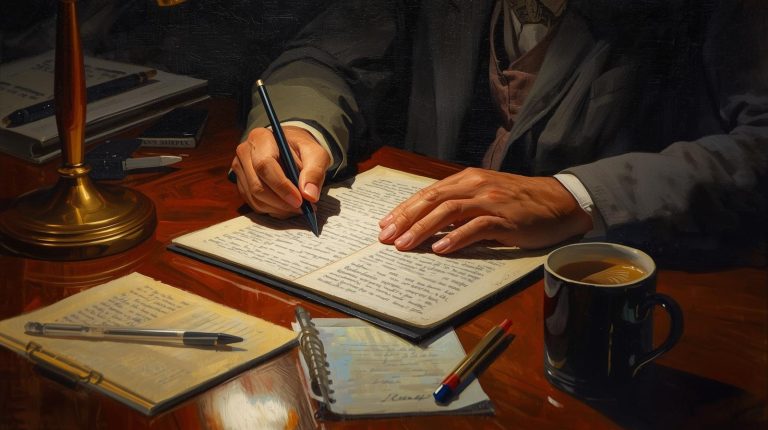
There is a moment when you hand someone your book and they run their hand over the cover before they even open it. That moment tells you everything about whether your production choices worked or not. I did not understand this when I started out. I thought the writing was the product and everything else was just packaging. It took a few print runs and some honest feedback to realize that the physical book is part of the experience, and the book printing company you choose along with the decisions you make about materials and finishing can either elevate your work or quietly undermine it. A premium looking book does not happen by accident. It is the result of specific intentional choices and most of them are more accessible than authors assume.
I want to walk you through what I have learned across multiple projects because I genuinely wish someone had laid this out for me before my first print run.
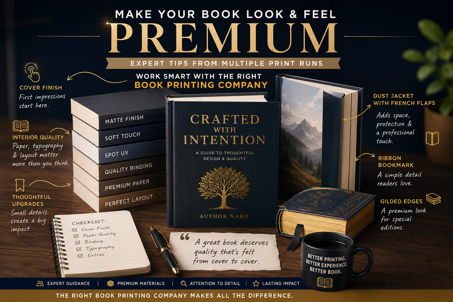
Why the Cover Finish Makes or Breaks First Impressions
The cover is where everything starts. It is the first thing a reader sees, the first thing they touch, and the thing they judge before they have read a single word. The printer applies this coating only to certain parts of the cover, usually the title or a standout design element, so you get that contrast between a shiny raised area and the flat matte background around it. The design matters enormously but the finish matters almost as much as the design itself. When I switched from gloss to matte finish on my covers the difference in how people responded to the physical book was immediate. People picked them up and held them longer. They commented on how the book felt without me prompting the conversation. Matte has a quieter confidence that gloss does not always carry.
Soft Touch Matte and Spot UV Worth Considering
Soft touch matte is the version of this that takes things a step further. It is a laminate that goes over the cover and gives it a texture that is almost velvety. The first time I held a book with soft touch matte I understood immediately why it costs more. It feels expensive in a way that is hard to describe but impossible to miss. Not every book printing company offers this as a standard option so you may need to ask specifically, but if your design suits it and your budget allows it, soft touch matte is one of the single most effective things you can do to make your book feel premium before a reader has seen one page.
Spot UV is another cover treatment worth knowing about. Traditional publishers do this on their bigger releases and honestly it works because when a reader picks up the book it just feels like someone sat down and thought carefully about every inch of it. The effect is subtle in photos but striking in person. When light hits a spot UV cover at the right angle the treated areas catch it in a way that looks almost like the design is slightly three dimensional. It is a technique that traditional publishers use on their higher end releases and it is the kind of detail that makes a reader feel like they are holding something that was made with care and attention. Again, not every book printing company provides this and it adds to your production cost, but for a book you want to position as a premium product it is worth asking about.
What Good Binding Does for Your Book
The spine of your book is something authors almost never think about and readers notice more than you would expect. A clean, well-designed spine with the title and author name clearly readable is a basic requirement. Beyond that, how well the binding holds together determines whether the spine still looks decent after someone has actually sat down and read the book. A book that cracks along the spine or starts to separate after one reading signals poor quality in a way that damages how readers think about you as an author. When you are evaluating a book printing company, ask specifically about their binding quality and request sample copies so you can open and close the book repeatedly to test how it holds. This sounds excessive but it is the kind of thing that separates a good printing partner from one who produces books that fall apart.
Choosing the Right Interior Paper for Your Book
Interior paper is where I see authors cut corners most often and where it shows the most. The paper inside your book affects how the text looks on the page, how images reproduce if you have them, how the book smells when it is new, and even how it sounds when you turn the pages. Standard white paper is perfectly acceptable for most books but it is not the only option and it is not always the best one. Cream paper, sometimes called off-white or natural, gives text a softer appearance on the page that is genuinely easier to read over long sessions. It also gives a book a warmer, more traditional feel that works beautifully for literary fiction, memoirs, and personal essays. For non-fiction or reference books where readers are scanning rather than reading linearly, bright white paper can actually work better because the contrast makes individual pieces of information easier to locate quickly.
How Paper Weight Changes the Feel of a Book
Paper weight matters too. Lighter paper makes a book feel insubstantial in a way that is hard to articulate but easy to feel. Heavier paper has a satisfying solidity to it and pages that feel like they have some substance when you turn them. If you are printing a shorter book that might otherwise feel thin in the hand, choosing a slightly heavier paper stock can give it a presence it would not otherwise have. Ask your book printing company what paper weights they carry because this is one of those things they will not always bring up on their own, and it genuinely changes how the finished book feels in your hands.
Interior Typography and Layout Done Right
Typography inside your book is another area that separates professional looking production from something that reads as self-published in the less flattering sense of that phrase. Fonts matter. Line spacing matters. Margin widths matter. The space between paragraphs matters. None of these things are expensive to get right but they require attention and some basic knowledge of what makes interior book design work. Books with too-tight leading are just tiring to read, even if the reader cannot quite put their finger on why. Inconsistent spacing throughout a book makes the layout look unpolished and poorly planned. Choosing fonts simply because they look interesting rather than because they perform well at body text size can make reading more difficult, even when readers cannot pinpoint exactly why they feel fatigued. I spent time learning basic interior design principles and it changed the quality of my books significantly without adding any production cost.
The Small Detail of Chapter Openers
Chapter openers are a small detail that makes a surprisingly large difference. The way a new chapter begins on the page, how much white space sits above the chapter number or title, whether there is a decorative element or ornament above the first line of text, all of this contributes to the rhythm and feel of the reading experience. Books that handle chapter openers thoughtfully feel like they were crafted. Books that slap a chapter number at the top of a page and jump straight into the text feel utilitarian in a way that slightly diminishes the experience even for readers who would not know how to explain what is bothering them about it.
Preparing Images and Graphics for Print
Images and graphics inside a book require more attention than most authors give them. If your book contains photographs, illustrations, charts, or any kind of graphic element, the resolution and the way they are prepared for print will determine how they actually look on the page. Screen resolution is 72 dots per inch. Print requires 300 dots per inch minimum and 600 for anything with fine detail. An image that looks sharp on your monitor will print blurry or pixelated if it has not been prepared at the correct resolution for print. I learned this from a printer who was kind enough to flag it before my files went to press rather than after, but not every book printing company will catch this for you. It is your responsibility to know the requirements and prepare your files accordingly.
Hardcover Upgrades That Make a Real Difference
Hardcover upgrades are worth discussing separately. The options expand significantly when you move from paperback to case bound books.
A dust jacket with French flaps is one worth knowing about. The jacket folds inward at the front and back covers. This creates extra panels for text and design. It is a detail that quietly closes the gap between an independent release and what you see in bookstores.
Ribbon bookmarks are another small but memorable addition. It is a fabric ribbon sewn directly into the binding. Readers use it as a placeholder. It costs very little to add but feels genuinely luxurious in the hand.
Gilded edges are reserved for special editions and collector releases. The page edges get a metallic finish applied to them. The visual impact is immediate. Anyone who picks up the book knows straight away they are holding something out of the ordinary.
None of these details are necessary for every book. But they are available through the right book printing company. Knowing they exist means you can reach for them when the project calls for it.
Packaging Presentation and Building a Printer Relationship
Presentation matters even after the book is printed. When you ship directly to readers the unboxing is part of the experience. A book rattling around in a plain box feels careless. How you protect it inside that box sends a message before anyone reads a word.
Small touches go a long way. Tissue paper, a handwritten card, even a sticker on the outside of the package. None of it costs much. But readers notice and they remember. They mention it in reviews and share it on social media in ways that genuinely help you.
The relationship you build with your printer matters more than most authors realize. The longer you work together the better they understand your standards. They start catching potential issues before those issues become real problems. They will sometimes mention materials or options that never appear on any public price list.
I have gotten access to better paper stocks and finishing options that way. None of it was advertised. I simply asked because I had built enough of a relationship to feel comfortable doing so. Treat your printer as a creative partner. You will get far more out of it than just a competitive price per unit.
Making your book look premium is not about spending the most money. It is about knowing which details matter for your specific book and your specific reader. Every choice covered here is accessible to independent authors. None of it needs a traditional publishing deal or an unlimited budget. It needs attention, intention, and a genuine willingness to learn what makes a physical book feel worth owning.