
A good cover tells a stranger the genre, the mood and the title in about two seconds. That’s what makes a good book cover work. Art skill barely comes into it. If someone has to squint or guess, they’re gone.
You’ve done this yourself. Scrolling, and you skip a book you’d probably have loved because the cover gave you nothing to hold onto. Covers tend to fail for the same few reasons, which means most of them are fixable before launch.
Your Cover Gets About Two Seconds
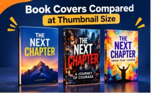
On a phone, your book is a postage stamp in a grid of dozens more. That’s how most people first see it. An Amazon book cover almost never gets studied. Most people don’t stop, they just scroll on.
Imagine Priya, a first-time thriller writer who’s fallen for a soft watercolor cover. On her laptop? Gorgeous. On a phone, the title blurs into the background and nothing says “thriller.” The art is fine. You just can’t read it.
That’s why I shrink a cover before I do anything else. Small-and-readable almost always scales up well, but plenty of big, beautiful covers fall apart when you shrink them. And there’s a promise hiding in there, too: the cover hints at how the book will feel to read. Your description and reviews either back that hint up or wreck it.
What Makes a Good Book Cover, Piece by Piece
The elements of a good book cover are fewer than you’d guess. A title that reads at a glance. An author name that stays modest. Then a clear genre signal, one focal point, and a palette with some self-control. Strong covers get all five. Weak ones usually fumble two or three, and it’s nearly always type, color or imagery.
Book Cover Typography That Survives a Thumbnail
Book cover typography is where covers quietly die. The title is usually the biggest thing on the page, so it has to stay readable even when the cover shrinks to the size of a stamp. Thin script fonts are the usual culprit. Low-contrast lettering is the other one.
Two typefaces, max. Choose a title color that clearly stands apart from the background, and keep any subtitle small or off the front altogether. Your name should read easily without competing with the title.
Here’s a quick check. Squint until the cover blurs. If you can still make out the title, it’ll probably survive a scroll.
Book Cover Colors and Mood
Color does its work before anyone reads a word. Book cover colors are also genre shorthand, because readers have picked up what to expect from certain palettes. See The Book Designer’s guide to genre color trends for examples.
But contrast beats the “right” shade. A perfect genre color is useless if the title drowns in it. Two or three main colors, one accent. That’s the whole recipe.
Borrow your colors from the focal image and the cover hangs together. Then use the accent on the title or a single small detail, so the eye lands where you want it first.
Keep to One Image and One Idea
Pick one image. Let it carry one idea. A collage of symbols sends the eye wandering, and wandering eyes don’t click.
If you’re using stock art, read the license before you get attached. Then do a quick image search, because a photo already sitting on five other covers makes your book look like everyone else’s.
Book Cover Design Principles You Can Actually Test
You’ve probably heard the standard book cover design principles: hierarchy, contrast, balance, simplicity. Sure. All true. The trouble is applying them to your own cover, when you’ve stared at it so long you can’t see it anymore. Two tests help with that.
The Shelf Neighbor Test
Grab six to eight covers from the top of your subgenre and line them up. Drop yours in the middle. Does it fit in? Can you still spot it quickly?
A good cover looks like part of the family but keeps its own face. Match the shelf too closely and nobody can tell you apart. Look like you took a wrong turn from another aisle, and your readers will pass you by.
What Makes a Good Book Cover Hold Up at Every Size
Export the cover at three sizes and check each one on a real device. Can you read the title as a thumbnail? On your phone, can you tell the genre within a second? At full size, is there anything worth a closer look?
Did the first check fail? Stop there and fix it before anything else. Fine detail only matters once the cover has earned a second glance.
What a Browsing Reader Actually Asks
Browsers don’t analyze anything. But they do ask three quick questions without noticing. What is this? What does it feel like? Is it for me?
If the cover answers all three before the title is even read, you’re in good shape. Not there yet? Tweak one thing, then check again.
Here’s what I do. I show the cover to a friend for three seconds, then ask them to look away and describe it. Whatever they say is what the cover actually communicates, even when it isn’t what you meant.

Mistakes That Quietly Cost You Clicks
Small slips drag down plenty of decent covers. These are the ones that keep showing up:
- Too many fonts. Suddenly it looks like a ransom note.
- A title buried in the busiest part of the image. Move it, or put contrast behind it.
- Copying a bestseller too closely. Readers catch on fast, and it comes across as a knockoff.
- Low-resolution art. Looks crisp on a monitor, comes out blurry on paper.
- No series look. Sequels should feel related at a glance.
Most of these take minutes to fix. Spotting them is the hard part, and that’s where a fresh pair of eyes pays off.
Genre Book Cover Design: Promise the Right Story
Genre book cover design comes down to expectations. People shop by genre, so your cover needs to promise the right sort of story. Promise the wrong one and you’ll attract readers who feel misled, and they usually say so in their reviews.
Take Marcus, who self-publishes a cozy mystery with a dark, moody cover. The people who’d love his gentle story scroll right past. Thriller fans click, then feel cheated. He redoes the cover in a warmer, illustrated style, and at last the cover matches the book.
This applies everywhere. A romance cover and a business book cover share almost nothing, since each crowd looks for different cues. Study your comps. Borrow the cues, never the artwork.
Ebook Cover Design and Print Covers Are Different Jobs
Ebook cover design only needs the front, since it’s seen small on a screen. Print is a bigger job: front, spine, back, and the bleed your printer wants. Sizes depend on page count and paper, so get your printer’s template rather than guessing.
The cover is just one piece of the listing, too. A strong image still needs a decent description and the right keywords behind it. For that side, see Amazon page optimization, and make sure your files are print-ready with book formatting.

How to Design a Book Cover Step by Step
Wondering how to design a book cover with no design training? Work in this order. It stops you from burning hours on tiny details before the big decisions are made:
- Jot down one line that captures the genre, mood and hook.
- Collect eight comparable covers and note what they share.
- Settle on one focal image and two or three colors.
- Design the title in grayscale first, then add color.
- Run the shelf neighbor test and the three-size test.
- Before they see the blurb, ask three readers of your genre what genre the book is.
Step four is the sneaky one. Grayscale leaves you with only contrast and shape, so a weak title can’t hide. Once color comes back, it’s a bonus.
When Professional Book Cover Design Is Worth It
Professional book cover design is worth a look if genre conventions feel fuzzy, you’re planning a series, or you need a print wrap. It’s also a smart move when you’re a few drafts in and the cover still feels off.
If you hire someone, bring your one-sentence promise and your comp covers. Find out which files come with the job (an ebook front cover, a print wrap) and how many revision rounds you get. The clearer your brief, the better the cover, and the fewer emails it takes to get there.
H2: Your Next Step: Check What Makes a Good Book Cover in Yours
You’ve got the pieces for what makes a good book cover. Now put your own cover through the wringer. Give it fifteen minutes:
- Shrink your cover to thumbnail size. Does the title still read?
- Line it up beside five comps from your subgenre.
- Ask three genre readers what kind of book it is.
If it passes, great. If not, you know what to fix. And if you’d rather hand it off, our team can help with book cover design.