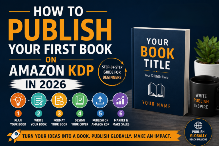
So you’ve written your book. Congratulations that’s genuinely the hard part. Now comes the bit that trips up almost everyone: formatting it correctly for Kindle.
Amazon’s Kindle Direct Publishing platform is remarkably accessible, but it does have rules. Understanding those rules before you upload can save you hours of frustration, rejections, and the sinking feeling of seeing your book look broken on a reader’s screen.
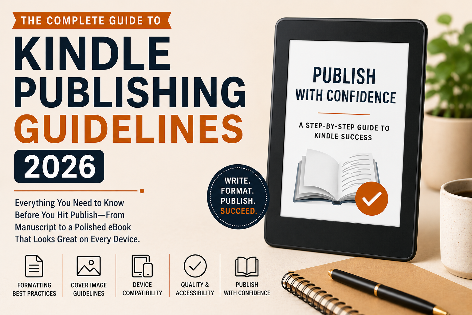
This guide walks through the official Kindle Publishing Guidelines in plain language so you can publish with confidence the first time around.
Why these guidelines actually matter
Amazon serves Kindle content across an enormous range of devices from the original Kindle e-ink readers and Paperwhite to Fire tablets, iOS and Android apps, and even desktop browser readers. Each of these environments renders content a little differently.
The guidelines aren’t bureaucratic red tape. They’re a checklist for ensuring your reader gets the experience you intended regardless of which device they’re reading on.
When authors skip these guidelines, the result is often broken formatting, missing images, navigation that doesn’t work, or covers that look pixelated on high-res screens. None of that is a good first impression on a reader who just paid for your book.
Paths to getting your content on Kindle
Before you worry about formatting details, you need to choose how you’ll deliver your content to KDP. There are three main paths, and the right one depends on your skill level and how much control you want.
Kindle Create
Amazon’s free desktop tool. Import a Word doc or PDF, apply a theme, export a publish-ready KPF. Perfect for fiction, memoirs, and self-help.
Word (.docx)
Upload a formatted .docx and KDP converts it automatically. Works well for simple text-heavy books, but gives you less control over the final output.
Hand-crafted EPUB
Full control over HTML and CSS. Essential for complex layouts, images, or interactive elements. If you’re comfortable with web tech, this is the way.
Comparing formats
Not all Kindle formats are created equal. The primary distinction is between reflowable content and fixed layout content.
💡 Amazon recommends Print Replica only for titles where the print layout is truly irreplaceable.
General best practices
Regardless of which format you choose, a few habits will keep your file healthy from the start.
Keep your source file clean
If writing in Word, avoid hitting Enter five times to create a page break that’s a classic mistake that causes chaos in conversion. Use paragraph styles, not inline formatting, wherever possible.
Get your image resolution right
Minimum 72 PPI for eBooks, though higher is always safer given today’s high-DPI Kindle displays. Always use RGB color mode for digital not CMYK.
Avoid special characters and decorative fonts
Em dashes created with hyphens, or fonts that haven’t been properly embedded, frequently render as little squares on some devices. Not a great look.
Cover image guidelines
Your cover is the single most important marketing asset for your Kindle book. Amazon has specific technical requirements, and meeting them isn’t optional a substandard cover image will either be rejected or display poorly in search results.
Technical specs
Minimum size
1000 × 625 px
Recommended size
2560 × 1600 px
Aspect ratio
1.6:1 (height:width)
Format / Max size
TIFF or JPEG · 50 MB
A high-resolution cover at the correct aspect ratio doesn’t just look better it signals professionalism to Amazon’s review process and to browsing readers alike.
Navigation guidelines
Kindle readers expect to be able to jump around your book easily. This is especially important for non-fiction, where a reader might skip to a specific chapter.
KDP requires two things: a functional NCX table of contents (machine-readable navigation data embedded in your EPUB) and an HTML table of contents (the human-facing page inside your book). These aren’t the same thing, and you need both.
Pro tip for long non-fiction
Add sub-entries to your NCX so readers can navigate to individual sections within chapters. It’s a small effort that significantly improves the reading experience.
HTML and CSS guidelines
If you’re building your EPUB from scratch or editing the HTML directly, Kindle’s rendering engine is based on WebKit but it doesn’t support every CSS property, and some things behave differently than you’d expect in a browser. Here’s what to live by:
DO
Use semantic HTML <h1> through <h6> for headings, <p> for paragraphs, <em> and <strong> for emphasis.
DO
Use em or % for font sizes (not px). This ensures your text respects the reader’s chosen font size preference.
DO
Place all your styles in a linked stylesheet inside the EPUB’s CSS file. Avoid inline styles as much as possible.
AVOID
position: fixed and position: absolute these don’t behave predictably across Kindle devices.
AVOID
Using tables for layout. Tables work but only for actual tabular data.
AVOID
Complex float-based layouts they break on smaller screens. Use float sparingly.
Accessibility guidelines
Making your book accessible isn’t just good ethics it’s increasingly a requirement for distribution on Amazon’s platform. KDP’s accessibility guidelines align with the EPUB Accessibility 1.0 standard and WCAG 2.0.
Alt text for every image
Every image needs meaningful alt text. Purely decorative images can use an empty alt="" this tells screen readers to skip them entirely.
Reading order must match HTML order
Don’t use CSS to visually reorder content in a way that doesn’t match the underlying HTML. Screen readers follow the HTML order, not the visual layout.
Proper heading hierarchy
Don’t skip from <h1> to <h4>. This confuses assistive technologies and breaks the document outline that screen readers rely on.
QA standards
Before you submit, Amazon expects you to have done basic quality assurance. This is where many self-publishers cut corners and it shows in the quality notifications they receive after publishing.
Your pre-publish checklist
- Download Kindle Previewer (free) and preview on every device type before submitting
- Pay attention to how images scale, whether your TOC works, and how chapter breaks render
- After publishing, check the Quality Notifications Dashboard in your KDP account regularly
- Run your EPUB through EPUBCheck malformed HTML causes inconsistent rendering and can trigger content review holds
Enhanced Typesetting and Page Flip
When your book qualifies for Enhanced Typesetting, Kindle applies advanced layout algorithms borrowed from print typography: improved kerning and letter spacing, better hyphenation, justified text with optical margin alignment, and drop caps.
Page Flip lets readers visually browse your book like a thumbnail view without losing their reading position. For it to work correctly, your content needs to be cleanly structured with proper page break markers.
Supported by Enhanced Typesetting: headings, paragraphs, lists, tables, inline elements like <em> and <strong>, plus CSS properties like font-family, font-size, text-align, margin, padding, and line-height.
Not supported: CSS transforms, animations, position: fixed, multi-column layout. Stick to the basics.
You’ve done the writing.
Don’t let a formatting shortcut undermine it.
The authors who build lasting Kindle catalogs aren’t necessarily the fastest publishers. They’re the ones who take formatting seriously from the beginning. The guidelines are your roadmap and following them is how your readers will thank you for it.