I spent four days formatting my first eBook for Amazon KDP. Four days. Not writing it, not editing it, just trying to make the thing look right inside a Kindle. By the end of it I had seventeen different versions of the same Word document saved on my desktop with names like “FINAL,” “FINAL v2,” “ACTUAL FINAL,” and “please god let this be the last one.” When I finally uploaded it and previewed it on the Kindle simulator, the table of contents was broken, my chapter headings were in three different sizes, and one image had somehow ended up sideways. That whole experience is what made me obsessive about eBook formatting, because I never wanted to go through that again.
If you are getting ready to publish on Amazon KDP and you have no idea where to start with formatting, this is the guide I wish someone had handed me before I wasted those four days.
First, understand what you are actually formatting for
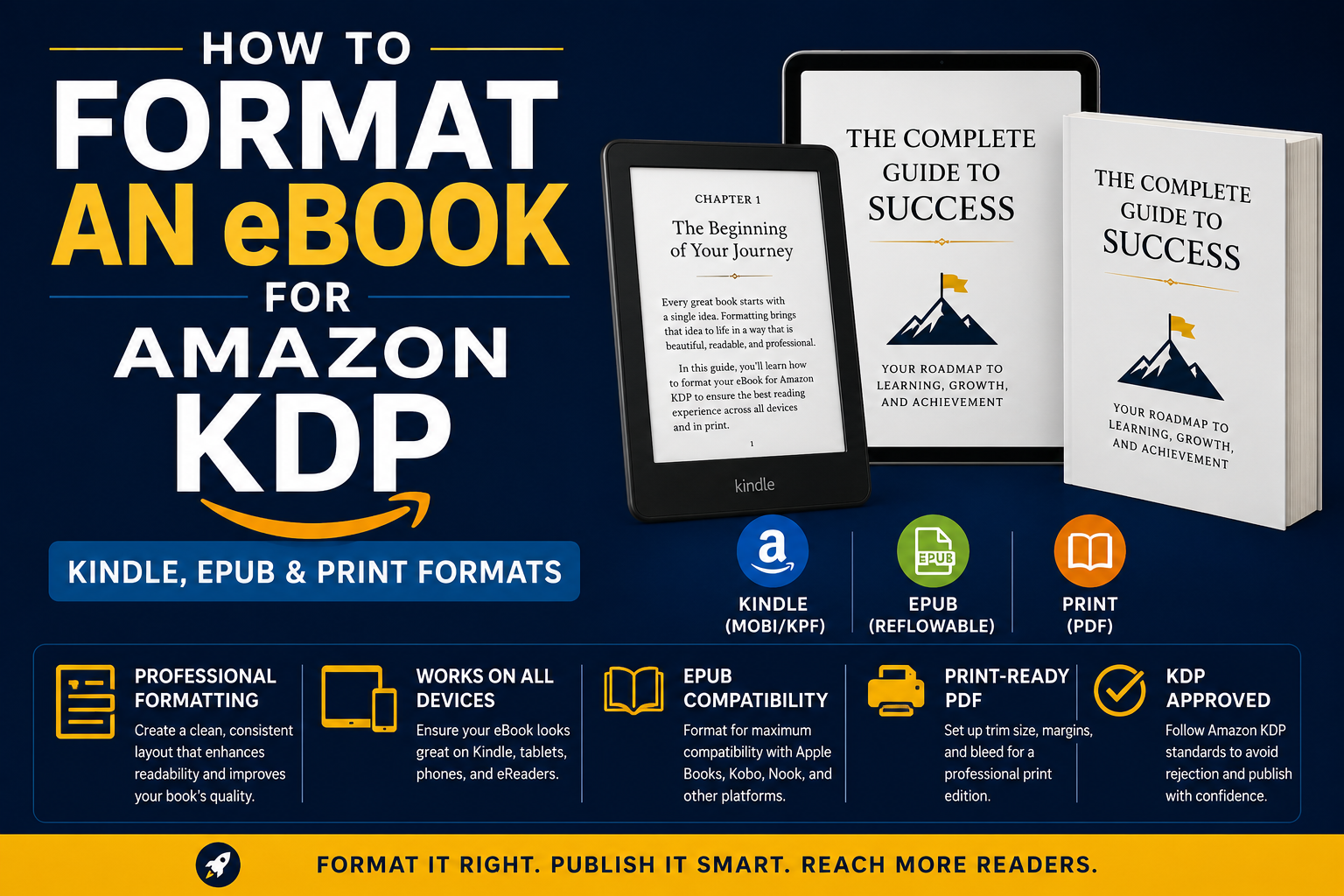
This tripped me up completely in the beginning. I thought “formatting my eBook” meant one thing. It does not. Amazon KDP has three completely different reading experiences and each one needs to be treated differently.
There is the Kindle eBook, which is what people read on Kindle devices and the Kindle app on their phones and tablets. Then there is the EPUB version, which is relevant if you are also distributing through other platforms like Kobo, Apple Books, or Google Play. And then there is print on demand through KDP Print, which is a physical paperback that Amazon prints and ships when someone orders it.
Each of these has its own rules, its own file requirements, and its own things that go wrong if you are not careful. Most guides online treat them like the same thing and that is where a lot of authors get confused. They are not the same thing at all.
Start with your Kindle eBook because it is the most forgiving to learn on
The first thing to understand about Kindle formatting is that Kindle is a reflowable format. That means the reader controls the font size, the font style, the background color, and the line spacing. Your book is not a fixed page like a PDF. It stretches and flows based on whatever settings the reader has chosen on their device.
This is actually good news once you understand it. It means you do not need to obsess over exact pixel measurements and margins the way you would for a print book. What you do need to obsess over is structure. Headings need to be actual heading styles, not just text you made bigger or bold. Paragraph spacing needs to come from styles, not from hitting the space bar twice. None of that visual shortcut stuff that works fine in a Word doc will survive the conversion to Kindle format.
When I first learned this about eBook formatting it genuinely changed how I worked. I went back into my manuscript and stripped out every manual space, every tab indent, every place I had bolded text to fake a heading. Then I rebuilt the whole structure using Word’s built-in styles panel and the difference in the final file was night and day.
Use styles for everything, not manual formatting
This is the single most important habit to build if you are serious about eBook formatting. In Microsoft Word or Google Docs, there is a styles panel that lets you tag each part of your document with a role. This paragraph is Heading 1. This one is Heading 2. This is Normal body text. This is a block quote. These tags are what get translated when your file converts to Kindle format or EPUB.
When you manually bold something and make it 18pt to fake a chapter title, the converter does not know it is a chapter title. It just sees big bold text and does what it wants with it. Sometimes that works out fine. Often it does not. I have seen chapter titles end up the same size as body text because of this exact issue.
The practical thing to do is this. Before you write a single word of your next book, set up your styles first. Define what Heading 1 looks like, what Heading 2 looks like, what your body text style is. Then apply those consistently throughout your manuscript. When the time comes to format, you will have almost nothing to fix.
The table of contents needs to be clickable, not decorative
In a print book, a table of contents is just a list with page numbers. On Kindle, it needs to actually work as navigation. Readers should be able to tap a chapter title in the table of contents and jump straight to that chapter. This sounds obvious but I cannot tell you how many times I have downloaded a Kindle book and found a table of contents that is just text sitting there doing nothing.
Amazon also requires a functional table of contents for Kindle books now, not just recommends it. They will flag your book during review if it does not have one. The easiest way to create one that actually works is to use the automatic table of contents feature in Word, which builds itself from your heading styles. If your headings are properly tagged, the TOC will build correctly and the links will work after conversion.
This is another reason the styles thing matters so much. Everything downstream in eBook formatting depends on getting the structure right at the source.
What file format should you actually upload to KDP
Amazon accepts Word documents (.docx) and EPUB files. For most people starting out, a properly formatted Word document works fine and is the easier path. But if you want more control over the final output, exporting to EPUB first and then uploading that gives you a cleaner result in most cases.
There is a tool called Atticus that I started using about two years ago and it genuinely made my eBook formatting life so much simpler. You write or paste your content in, apply your styles, and it exports a properly formatted EPUB and a print-ready PDF at the same time. Scrivener does something similar. Both cost money but if you are publishing more than one or two books they pay for themselves quickly in saved frustration.
If you are going the Word route, the one thing I want you to remember is to check your document in Amazon’s free Kindle Previewer app before you upload. Download it, load your file, and actually read through several chapters on the simulated device. Look at how the headings render. Check that images are not weird. Make sure your table of contents links work. This step catches probably 80 percent of formatting problems before they become published formatting problems.
Images need special attention in Kindle formatting
Images in Kindle books are their own category of headache. The thing that catches most authors off guard is that images need to be high enough resolution to look decent on a Retina iPad screen but small enough in file size that your book does not take forever to download. Amazon has a maximum file size for Kindle books and if your images are not compressed you can hit that limit faster than you expect.
The rule I follow is to save images at 300 DPI but export them compressed for web, keeping each image under 127 kilobytes if possible. I use a free tool called Squoosh to compress images quickly before dropping them into my manuscript. Also, never paste images directly into Word from another application. Always insert them using the Insert menu so Word actually embeds the file rather than linking to something on your hard drive that will not exist when KDP processes your upload.
Now let us talk about EPUB if you are going wide
If you are planning to publish on other platforms alongside Amazon, or if you ever leave KDP Select exclusivity, you will need an EPUB file. The good news is that an EPUB is basically just a packaged version of the same content you already have. The same rules about heading styles and proper structure apply.
The difference is that EPUB files tend to be stricter about clean code underneath. If you export a messy Word document to EPUB, the underlying HTML that powers the file can end up full of redundant styling code that causes rendering issues on different e-readers. Kobo handles things slightly differently than Apple Books which handles things slightly differently than the Kindle app. If your EPUB has sloppy code underneath, those differences start to show.
The cleanest way to produce an EPUB is to use dedicated software like Atticus, Sigil, or Vellum rather than converting from Word. Sigil is free and lets you actually look at and edit the HTML inside your EPUB if you are comfortable with that. Vellum is Mac-only and expensive but produces genuinely beautiful EPUB files with very little effort. For most people publishing on a budget, Atticus hits the best balance between price and output quality.
Print formatting is a completely different project
I want to be honest with you here. Print formatting for KDP Print is harder than Kindle formatting and takes longer. A print book is a fixed layout. The reader cannot change the font size. Every page has to look right at exactly the size you chose. Margins matter because the inside margin near the spine needs to be wider than the outside margin or text gets swallowed into the binding. Headers and footers with page numbers need to be set up correctly. Chapter openings traditionally start on a right-hand page.
This is where a lot of self-published books reveal themselves as self-published, not because of the content, but because the interior formatting looks off in ways that are hard to name but easy to feel as a reader.
The file Amazon wants for print is a PDF with specific margin settings based on your trim size and page count. KDP has a template library you can download for free that sets up your Word document with the right margins for whatever size book you are making. I strongly recommend starting from one of those templates rather than trying to set margins manually. The templates also include a sample of what correctly formatted front matter looks like, which is genuinely useful if you have never laid out a book before.
For my own print books I use Atticus for the layout and export a PDF directly from there. The result looks professional without me having to know anything about book design beyond basic common sense. If you want to go deeper into print layout, learning the basics of Adobe InDesign is worth the time. But for most authors publishing their first few books, a good template and a careful eye will get you where you need to go.
The step most authors skip and then regret
After you have done all your formatting, before you submit anything to KDP, order a proof copy of your print book. Amazon makes this easy. You can order a single copy at cost before your book goes live. Hold it in your hands. Read actual pages. You will catch things on a physical page that you will never catch on a screen. A widow at the top of a page, a heading that sits awkwardly at the bottom of a page with no text following it, an image that printed darker than it looked on your monitor.
This step costs maybe six or eight dollars depending on your book length and it has saved me from publishing embarrassing formatting errors more times than I want to admit. Treat it as a non-negotiable part of your eBook formatting and print process, not an optional extra.
The whole thing is learnable, I promise
When I think back to those four days of formatting chaos and seventeen saved document versions, what I mostly feel is grateful. Not for the suffering, but for what it forced me to actually learn. Proper eBook formatting is not complicated once you understand the logic behind it. Structure first, styles always, test before you publish, and never assume the converter will fix your mistakes because it will not.
Your readers are going to judge your book within the first two minutes of opening it. Not just on the writing, but on how it feels to read. A well-formatted book feels professional and trustworthy before the reader has processed a single idea. That first impression is completely within your control. Take the time to get it right.