I published my first paperback through KDP about two years ago and spent way more nights than I’d like to admit fighting with margins and fonts. KDP book formatting is one of those things nobody really explains properly until you mess it up once and see your book looking cramped or oddly spaced on a physical copy. So I figured I’d just walk through what I learned, mostly through trial and error, about getting fonts and margins right.
This isn’t going to be some textbook guide. It’s more like me telling you what actually worked for me after formatting four books and rejecting probably a dozen font choices along the way.
Why Fonts and Margins Actually Matter
When I started out I honestly thought this stuff was minor. Like, who cares what font a book uses as long as people can read it. Turns out readers care a lot more than I expected. A bad font choice or cramped margins can make even a great story feel exhausting to read, and that shows up in reviews. I had someone mention in a review that my first book felt cluttered, and looking back, my margins were way too tight and my font was a touch too small for comfortable reading.
Good KDP book formatting isn’t just about looking professional, it actually affects whether people finish your book or put it down halfway through because their eyes got tired.
What I Got Wrong The First Time
My first book used a font I picked because I liked how it looked on my screen. Didn’t think about how it would print. Turns out fonts behave differently on paper than on a laptop display, and what looked clean on screen ended up looking thin and hard to read once printed. Lesson learned the hard way.
Best Fonts For KDP Book Formatting
After a lot of testing, and I mean printing proof copies multiple times just to check fonts, here’s what I settled on and what other authors I’ve talked to tend to use too.
Garamond
This one is a classic for a reason. It’s a serif font, fairly narrow, which means you fit more words per page without it feeling cramped. I used this for my second book and honestly it just looks like a proper printed novel. A lot of traditionally published books use something similar, so readers are already used to it subconsciously.
Georgia
This is another solid choice, slightly more modern looking than Garamond but still easy on the eyes for long reading. I switched to Georgia for one of my nonfiction books because it felt a bit more approachable and less old fashioned for that genre.
Caslon
A friend of mine who’s been self publishing longer than me swears by Caslon. I tried it for a short story collection and it worked nicely, has a slightly more classic, literary feel to it. Good if your book leans more toward literary fiction or something with a quieter tone.
Avoid Fonts Like Times New Roman
I know it’s tempting because it’s the default in most word processors, but Times New Roman tends to look a bit generic and overly used for printed books. It’s fine for manuscripts you’re sending to editors, but for the actual published version, I’d steer away from it if you want your KDP book formatting to feel more polished.
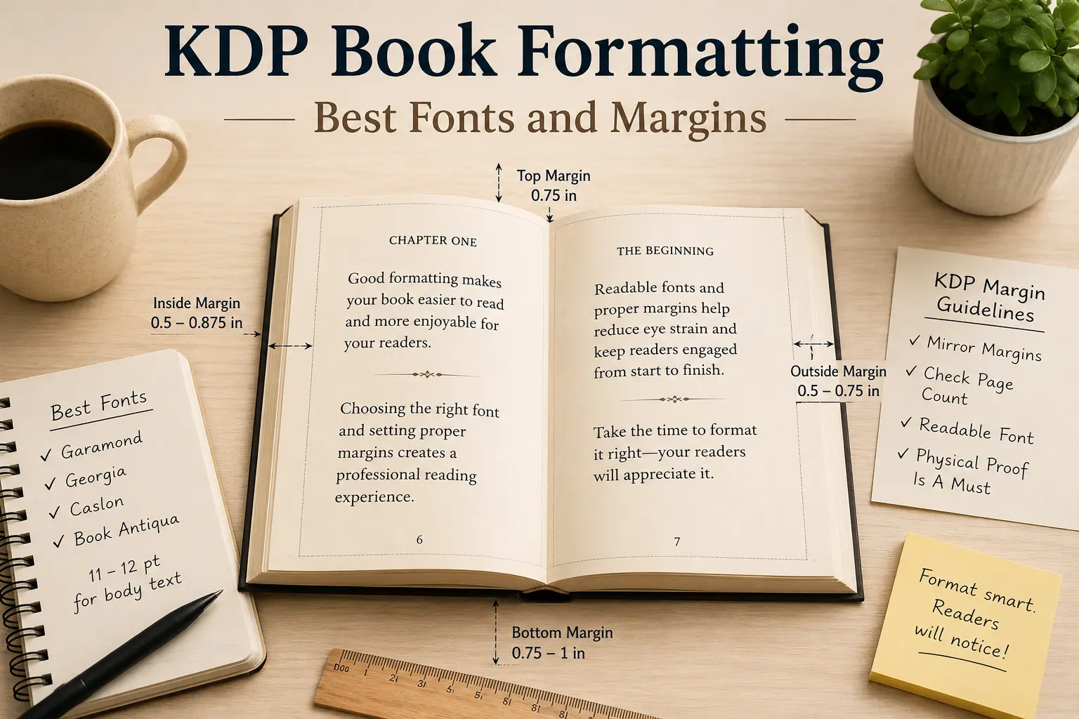
For most fiction, stick with somewhere between 11 and 12 point font, depending on the specific font’s natural size since some fonts run smaller or larger than others even at the same point size. Always print a proof copy and physically read a few pages before locking in your final size.
Best Margins For KDP Book Formatting
Margins were honestly more confusing to me than fonts at first because KDP has specific requirements depending on your book’s page count, and if you get it wrong your file can actually get rejected or look wrong once printed.
Understanding Amazon’s Margin Requirements
KDP requires different inside margins depending on how many pages your book has. The more pages, the wider the inside margin needs to be because of how the binding works. For a book under 150 pages, you’re usually fine with around half an inch on the inside margin, but once you start getting into 300 plus pages, you need closer to seven eighths of an inch or your text can get swallowed up near the spine.
I learned this the annoying way when my first proof copy came in and part of the text near the inside margin was almost touching the binding. Had to redo the whole file and order another proof, which cost extra time and a bit of money too.
Outside and Top Bottom Margins
For the outside margin, meaning the side away from the spine, I usually go with around half an inch to three quarters of an inch. Too narrow and it feels claustrophobic, too wide and you waste page space which can bump up your page count and printing costs unnecessarily.
Top and bottom margins I keep fairly consistent, usually around 0.75 inches on top and a little more on the bottom to leave room for page numbers without things feeling crowded.
Mirror Margins For Print Books
Something I didn’t know early on is that for print books you need mirror margins, not the same left and right margin on every page like you would in a simple word document. This means your inside margin shifts depending on whether it’s a left or right page. Most formatting tools or templates handle this automatically once you set it up correctly, but it’s worth double checking before you upload your final file.
Tools That Helped Me With KDP Book Formatting
Vellum
If you’re on a Mac, Vellum genuinely made my life easier. It handles a lot of the technical margin and font stuff automatically and gives you a live preview of how the book will actually look printed. I switched to this after my second book and wish I had used it from the start.
Atticus
For those not on Mac, Atticus is a solid alternative. It’s cross platform and does a similar job, letting you preview your formatting before exporting the final file for KDP.
Manual Formatting In Word
My very first book I formatted entirely in Word, manually setting margins and fonts myself. It’s doable, but honestly it’s tedious and easy to mess up small details like consistent paragraph spacing or making sure your margins are mirrored correctly. If you’re on a tight budget though, it’s still a workable option, just be ready to triple check everything.
A Few Extra Lessons I Picked Up
Always Order A Physical Proof
I cannot stress this enough. Looking at your formatting on a screen, even a formatted PDF preview, does not tell you the full story. Order a physical proof copy before you publish. I caught margin issues, font sizing problems, and even a weird spacing glitch only after holding the actual printed book in my hands.
Test Different Fonts On the Same Page
Before settling on a font, I usually format one sample chapter in three or four different fonts and just sit with each version for a day. Reading the same content in different fonts really highlights which one feels right for your specific book and genre.
Don’t Overthink It Forever
This one’s important too. I spent way too long on my third book obsessing over tiny font differences that honestly most readers will never notice. At some point you have to just commit to a solid, readable choice and move forward. Good enough and consistent beats endlessly perfect and never published.
Quick tip before you go: pick a readable serif font, respect Amazon’s margin requirements based on your page count, and always order that physical proof before hitting publish. These three things alone solve most KDP book formatting problems.
Final Thoughts
Getting KDP book formatting right takes a bit of trial and error, and honestly even now I still tweak small things with each new book I publish. But once you understand the basics of solid font choices and proper margins, the process gets a lot less intimidating. Pick a readable serif font, respect Amazon’s margin requirements based on your page count, and always, always order that physical proof before hitting publish.
Looking back at my early formatting mistakes, I’m kind of glad I went through them because now KDP book formatting feels like second nature instead of this scary technical hurdle. If you’re just starting out, take your time with this part, your readers will notice the difference even if they can’t always explain exactly why.