Okay so you finally finished your book. Now everyone and their cousin is telling you that you need a website. Here’s the thing though, if you’re trying to figure out how to build an author website that actually sells books instead of just sitting there looking pretty, most of the advice floating around online is kind of useless. I’ve watched authors nail this and I’ve watched them completely botch it, and honestly the gap between the two usually comes down to a handful of decisions nobody ever warns you about.
I’ll say this upfront too, because I think it needs saying. A website by itself won’t sell a single copy. It’s not magic, no matter what some course seller on Instagram tells you. But when it’s set up the right way, it quietly becomes one of the most useful tools you own, turning random visitors into people who actually buy your books and then keep coming back for more.
Why Most Author Websites Don’t Sell Anything
Let’s be honest for a second. Most author websites look more like digital business cards than anything else. A home page, an about page, maybe a contact form if you’re lucky, and that’s basically the whole thing. Nice looking? Sure, often. Actually doing something for you? Not really, no.
The problem, I think, is that a lot of authors build their site like it’s a brochure. And a brochure just sits there hoping someone reads it. What you want instead is something closer to a funnel, a path that leads a visitor step by step toward buying your book without them even realizing they’re being led somewhere.
I worked with a fantasy writer a couple years back, and her site was genuinely gorgeous. Great artwork, smooth design, professional photo, the whole package. Sales barely moved though. When we dug into why, it made total sense. People landed on her homepage, admired it for a minute or two, and then left. No mailing list signup in sight. No obvious next step. Nothing pulling them any further in.
That’s the exact trap we’re trying to dodge here.
What Your Website Is Actually For
Your site has one real job, even if it doesn’t feel that way while you’re building it. It needs to turn visitors into readers, and readers into buyers. Every page, every sentence, every button on there should be quietly working toward that.
That doesn’t mean slapping “BUY NOW” banners everywhere like some late night infomercial. It just means each piece should nudge people, gently, closer to picking up one of your books.
The Pages You Actually Need (And the Ones You Really Don’t)
When people decide to build an author website, they usually overcomplicate things fast, adding a dozen pages nobody will ever click on. Let’s cut through that.
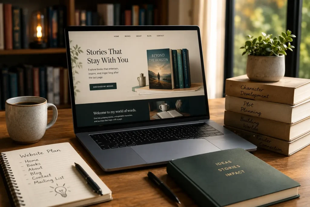
Your homepage has one job. Tell people instantly what kind of books you write. Don’t make someone scroll around guessing whether you’re a romance author or writing true crime. Just say it, right at the top, no mystery required.
Your books page needs to be more than a list of titles sitting there looking sad. Give each book its own page. Strong description, good cover, links to buy from more than one retailer, an excerpt if you can swing it. People like sampling before they commit, kind of like trying on shoes before you buy them.
Your about page is honestly where a lot of authors phone it in. Stiff, formal bio, the kind you’d expect tucked inside the back flap of a hardcover. That’s fine there. Not so great on a website. Here you want something more personal. Why do you write what you write? What pulled you into this genre in the first place? People connect with a person, not a resume, and I think we forget that constantly.
Then there’s the mailing list. Honestly non negotiable at this point. Your email list is the one thing online that’s actually, fully yours. Platforms change their algorithm overnight, apps come and go, but that list stays with you no matter what happens elsewhere.
Contact Pages and Media Kits Matter More Than You’d Guess
A basic contact page seems obvious enough, but you’d be shocked how many authors bury it three menus deep. Once bloggers, podcasters, or a local reporter start noticing your work, you want to be easy to reach. Not a scavenger hunt.
And if you’re chasing any kind of publicity, a media or press page saves you a ton of back and forth down the road. Author photo, book covers, short bio, maybe a few sample interview questions ready to go. Journalists and podcast hosts genuinely appreciate when this stuff is handed to them already assembled.
Design Decisions That Quietly Affect Sales
This part tends to catch people off guard. Your website’s design isn’t only about looking polished and pretty. Certain choices directly affect whether someone sticks around long enough to actually buy anything at all.
Loading speed is one of those things nobody thinks about until it’s already costing them sales. If your site drags, especially on someone’s phone, they bail before they even see your books exist. Nobody’s patient anymore. I’m not either, if I’m being honest.
Mobile responsiveness matters just as much, maybe more. A huge chunk of your traffic is probably someone scrolling on their phone after clicking a link from Instagram or wherever. If the site looks cramped or broken on mobile, you’re losing readers and you’ll never even know it happened.
Keep navigation simple too. If someone has to hunt around for the buy button, you’ve already lost them. Home, books, about, contact, maybe a blog if you’re into that. That’s usually plenty, you don’t need ten dropdown menus.
Visuals Do More Work Than People Give Them Credit For
Covers sell books, whether we’re talking a bookstore shelf or a website page. Keep every cover image sharp and high resolution. A blurry, pixelated cover makes even brilliant writing look amateur before anyone’s read a single word of it.
Author photos matter too, more than most people expect going in. A warm, approachable photo builds trust fast. People buy from someone who feels like an actual human, not a logo or a brand mascot.
How to Build an Author Website Without Losing Your Sanity
If you’re not particularly tech savvy, the whole idea of building a website can feel like climbing a mountain in flip flops. Good news though, you genuinely don’t need to know any code to build an author website that looks sharp and professional.
Platforms like WordPress, Squarespace, and Wix all have templates built specifically with authors in mind. These already include most of the structure I mentioned above, book pages, about sections, mailing list boxes, all of it sitting there ready. You’re not starting from a blank page, thankfully.
That said, a template only gets you halfway. The words you fill it with matter just as much as how it looks, maybe more. Your book descriptions need to hook someone in the first sentence or two. Your bio needs some actual personality in it. Your homepage should say clearly, immediately, what you write and why anyone passing through should care even a little.
If writing that stuff makes you nervous, and for a lot of authors it does, it might be worth hiring someone to polish the copy. Kind of like hiring an editor for your manuscript, except for your website. Good web copy is its own skill honestly, and a second pair of eyes usually catches things you’d never notice on your own.
Getting Your Sales Links Right
Here’s a mistake I see all the time. Authors dump five separate Amazon links across a page and call it a day. Instead, use a universal book link service that figures out the reader’s country and sends them to their preferred retailer automatically. Small detail, sure, but it removes friction, and less friction almost always means more sales at the end of the day.
Turning Visitors Into Readers Who Actually Stick Around
Selling one book is nice. But the real goal, the bigger one, is building something that brings people back for your next release, and then the one after that too.
This is where the mailing list earns its keep all over again. Offer something worthwhile in exchange for a signup. A free short story, a bonus chapter, a character guide, whatever feels like a genuine gift instead of a sales pitch in disguise. Once someone’s on your list, you’ve got a direct line to them for every future book you ever put out.
Blogging helps too, though it’s not required by any means. Sharing updates about your writing process, upcoming releases, or just some behind the scenes thoughts keeps people engaged between books. It also gives search engines something to chew on, which slowly helps new readers stumble onto you over time.
Consistency Builds a Kind of Trust You Can’t Fake
Whatever tone you pick for your site, stick with it across every single page. If your books are dark and moody, your website probably shouldn’t look bright and cheerful like a kids’ birthday party. Readers notice that mismatch, even when they can’t quite explain why something feels a little off to them.
Final Thoughts
At the end of the day, learning to build an author website comes down to treating it like a working tool instead of a decoration you hang up once and forget about. Every page should have a purpose. Every design choice should remove friction, never add to it. And every word on there should nudge someone a little closer to becoming a loyal reader who actually cares about your next book.
You don’t need a massive budget or advanced tech skills to pull this off, not even close. What you need is some clarity about what you’re actually trying to do, and a willingness to put a bit of yourself into the content instead of leaning on generic templates and stiff, corporate sounding language. Do that, and your website stops being just a digital business card sitting in a drawer somewhere. It becomes one of the hardest working tools you’ve got in your entire career as a writer.

![The Complete Amazon KDP Publishing Guide: Ebook, Paperback & Hardcover [2026 Edition]](https://theauthorcentral.com/blog/wp-content/uploads/2026/10/Amazon-KDP-Publishing-Guide-2026-768x512.webp)