A friend of mine spent eighteen months writing her first novel. She knew it was good. Her beta readers loved it. She self-published it, shared it everywhere she could, and then sat there watching the sales trickle in at a pace that felt almost insulting given how hard she had worked. Somewhere in the middle of trying to design a book cover, she opted for a quick DIY solution. Three months later, someone in a writing group finally said what nobody else had: the cover looked like it was made on a free website in twenty minutes. Because it was.
She redesigned it, hired a proper cover designer who actually understood her genre, and within a few weeks her sales had tripled. Same book. Same blurb. Same price. Different cover. That experience stuck with me, because it shows just how much weight a cover carries when you are trying to get a stranger to take a chance on your work.
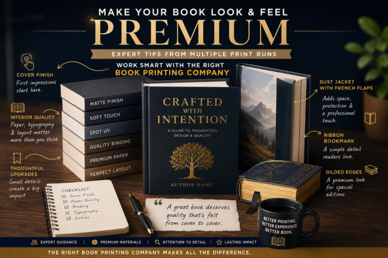
If you want to design a book cover that does its job properly, you have to stop thinking of it as the last step you rush through before publishing. It is one of the most important decisions the whole project depends on. And the good news is, once you understand what makes covers actually work, the process gets a lot less mysterious.
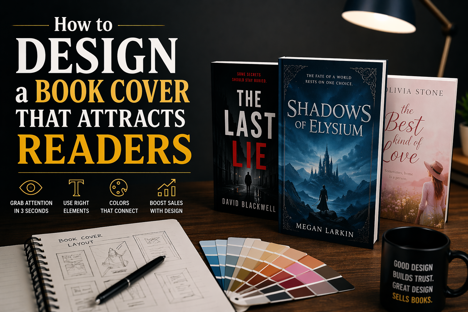
Three Seconds. That Is What You Get.
Walk into any bookstore or scroll through a retailer page and think about how you actually behave as a reader. You are not carefully studying each title. You are scanning, and something is either catching your eye or it is not. That moment of catching happens in roughly three seconds, sometimes less. Everything your cover needs to communicate has to land in that window.
This is not a complaint about short attention spans. It is just how browsing works. Readers have developed a visual instinct for genre over years of consuming books. A certain kind of cover tells them instantly, this is a thriller, or this is a cozy mystery, or this is the kind of literary fiction I reach for when I want to feel something. They are not consciously running through a checklist. The cover is speaking to something faster than conscious thought.
When your cover sends mixed signals, or when it looks like it belongs in a different genre entirely, readers do not stop to investigate further. They just move on. And they move on so quickly that they probably could not even tell you afterward which cover put them off. That is why getting the signals right matters so much more than most authors expect.
The Six Things Every Cover Has to Get Right
When you sit down to design a book cover, you are essentially assembling a puzzle where every piece has a specific job. Leave one out and the whole thing starts to feel like something is off, even if the viewer cannot put their finger on exactly what.
Sets the entire world before a word is read. Genre, mood, and tone all live here.
The loudest visual signal on the cover. Your font choice talks genre whether you mean it to or not.
Size it relative to your name recognition. Debut authors go small. Known names can go large.
Readers feel color before they process it. Dark and moody means one thing. Bright and warm means another.
Where does the eye go first, second, third? If you cannot answer that, neither can your reader.
Online, most readers see your cover at the size of a postage stamp. It has to work there first.
None of these elements carries the whole thing alone. A gorgeous image with an unreadable title is a wasted opportunity. A great font choice on a muddled composition still confuses the eye. They all have to speak the same language at the same volume.
The Font Is Louder Than You Think
Most authors treat typography as an afterthought, and it shows. Picking a font because it looks pretty in the design software is one of the most common cover mistakes I see. At full resolution on your laptop screen, sure, that elegant hand-lettered script looks gorgeous. Shrink it down to an Amazon thumbnail and it becomes an illegible smear that could say anything.
The title of your book needs to be the commanding visual element on the front cover, and it needs to survive being displayed very small. That requirement rules out a surprising number of fonts that look wonderful at large sizes. Bold, clear, and readable beats beautiful and unreadable every time when the goal is actually getting people to pick up the book.
Try this right now
Export your cover design and shrink it to 80 x 120 pixels. Look at the title. If you are squinting or guessing at letters, go back and change the font. That tiny version is what most of your potential readers will see first.
Serif versus sans-serif: it matters more than you think
Serif fonts carry baggage, in the best way. Those small strokes finishing each letter have spent decades appearing on literary novels, historical fiction, and serious nonfiction. Readers have absorbed those associations without knowing it. A serif title whispers literary weight and tradition. A sans-serif font feels faster, cleaner, more urgent. Neither is wrong. Both just speak different dialects, and you want your cover speaking the same dialect as your genre.
Keep the whole cover to two typefaces at an absolute maximum. More than that and the eye starts to feel unsettled before it can settle on the title. One strong display font for the title, one clean complementary font for the author name, and you are done.
Color Does Emotional Work You Cannot Do With Words
Before anyone reads a single word on your cover, the color palette has already set an emotional tone. Deep navy and charcoal tell one story. Warm gold and aged parchment tell another. Hot pink and electric teal tell something else entirely. This happens fast, and it happens whether you planned it or not, which means you might as well plan it.
The covers that tend to feel amateurish often share one specific problem: too many colors. Five or six distinct hues competing for attention create a kind of visual noise that reads as confusion or desperation. The covers that hold your eye usually commit to one dominant color, one supporting tone, and a tight accent used once or twice. That restraint signals confidence. Readers pick up on it even when they cannot articulate why one cover feels more trustworthy than another.
Contrast between your title text and the background image is non-negotiable. Even a slight blending of text into image costs you readability at thumbnail size. High contrast is not a stylistic preference here. It is a functional requirement, and the smaller the display size, the more unforgiving that requirement becomes.
Know the Visual Grammar of Your Genre Before You Break It
Genre conventions are not a cage. They are a language. When you design a book cover that fluently speaks that language, your target readers immediately feel like the book was made for them. When you ignore those conventions because you want to stand out, you risk the far more damaging outcome of standing out in the wrong direction, repelling the readers who would have loved the book and attracting nobody in their place.
Romance covers lean into faces and bodies and warmth because the genre is fundamentally a promise about human connection. Thrillers go dark and tense and sharp because pace and danger are the whole offering. Fantasy uses illustrated worlds and creatures and impossible landscapes because it is selling the feeling of being somewhere completely other. Nonfiction and self-help use clean, type-forward designs because authority and practical value are what the reader is paying for.
Spend an honest hour looking at the top 100 bestsellers in your genre on Amazon before you commit to any design direction. Do not copy anyone. Just absorb the visual grammar. Notice what keeps appearing. Notice what the successful covers share that you might not have noticed before. That pattern is your reader’s trust map, and learning to read it is the most useful thing you can do before the design process starts.
The Mistakes That Keep Showing Up
Some cover problems are so common they almost feel like rites of passage in self-publishing. Recognizing them in advance is easier than fixing them after a cover has been live for six months.
Overused stock photography is probably the most visible one. Browse any self-publishing genre category long enough and the same stock model starts appearing on cover after cover. Readers notice even when they cannot name it. Something feels generic, recycled, off. If there is any room in the budget at all, spending it on better or more exclusive imagery tends to return more than almost any other investment in the cover.
Overcrowding the front cover is the next most common problem. Taglines, series titles, awards, endorsements, subtitles, all fighting for space until there is no clear focal point left. The front cover needs to do one thing well. It needs to make someone stop scrolling. Every element beyond the core three, image, title, author name, should earn its place or get moved to the back.
And print authors: do not forget the spine. A book sitting on a shelf in a store is showing the spine, not the front cover. If the title is impossible to read sideways, or cramped into illegibility, the best front cover work in the world will not save it at retail.
Should You Do It Yourself or Hire Someone?
This one depends a lot on your background and your honesty with yourself. Tools like Canva and Adobe Express have genuinely improved to the point where someone with real design instincts and a solid understanding of their genre can produce a competitive cover. The keyword there is someone with real design instincts. Having access to a design tool is not the same as knowing what to do with it.
If you want to design a book cover yourself, commit to learning before you start making. Study covers in your genre obsessively. Understand why specific choices were made, not just what was chosen. Give yourself time to produce multiple versions and get genuine feedback from readers in your genre, not from people who care about your feelings more than your sales numbers.
If you hire a designer, look specifically for someone who works on books, not someone who designs logos and brochures. Book cover design is its own discipline. Genre knowledge, thumbnail readability, spine layout, retail platform requirements, these are all things a specialist understands and a general graphic designer might not even know to think about. Brief them with visual references, not descriptions of your plot. Show them five covers you love and three you hate and let them start there.
Test It With Real People Before It Goes Live
Almost nobody does this, and almost everybody should. Putting your cover in front of actual readers in your genre before committing to it costs almost nothing and can save you months of disappointing sales.
The questions you ask matter a lot. Skip “do you like it?” entirely. That question gets you polite answers. Instead ask what genre they think the book belongs to. Ask what kind of reader they imagine picking it up. Ask if they would stop scrolling if they saw it on Amazon. Those answers tell you whether the cover is doing what you intended, or sending signals you never planned to send.
Also test the thing in different environments. At thumbnail scale. On a white background. On a dark background. In grayscale, just to see if the composition holds up without color carrying the whole weight. A cover that survives all of those tests is a cover that works.
Before you hit publish
Run through this: Is the title legible at 80px wide? Does the imagery match what readers expect from your genre? Are there two fonts or fewer? Is text clearly readable against the background? Is the color palette three tones or fewer? If it is a print edition, is the spine readable and the back cover complete?
One last thing worth saying
The cover is not where you express yourself as an author. The book is where you do that. The cover is where you have a conversation with a stranger who does not know you yet, and you have about three seconds to make them feel like your book was written for them.
Get that conversation right and everything else gets easier. The readers who were always going to love your work find it faster. The ones who were on the fence lean in instead of scrolling past. That is what it means to truly design a book cover that works. Not just one that looks nice, but one that does its job every single day without you being there to explain it.